# How to Customize the Value Axis in Your Chart
### How to Customize the Value Axis in Your Chart
Customizing the value axis in your chart enhances readability and ensures accurate data representation.By adjusting settings such as the tick interval, you can make your chart easier to understand and visually appealing.
#### Steps to Customize the Value Axis:
**1. Access the Value Axis Settings:**
* Go to the “Axes” tab in your chart settings.
* Locate the value axis options.
**2.Adjust Tick Interval:**
* Set the “Tick Interval” to match the range of your dataset.
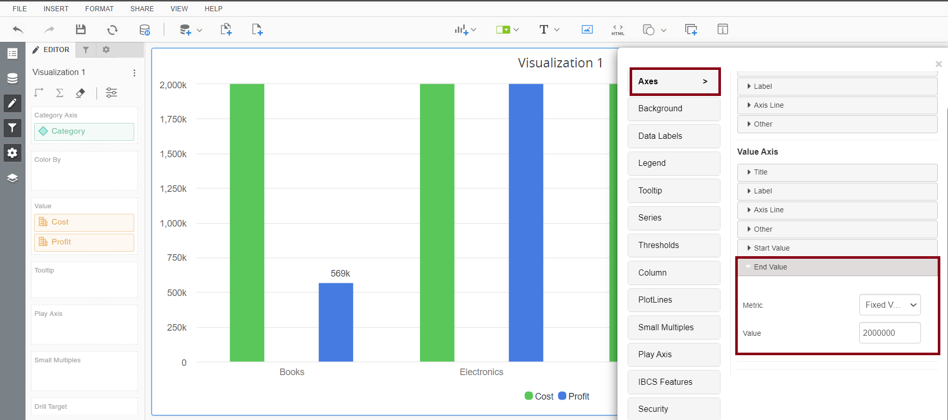
**Example:**
The tick interval is like the spacing between marks on a ruler. For instance, if your data ranges from 0 to 20 million, you might set the tick interval to 2 million. This means you will see marks at intervals of 2 million units (0, 2M, 4M, 6M, …, 20M). Adjusting the tick interval based on your data’s range ensures that the chart remains clear and easy to read.
---
# Agent Instructions: Querying This Documentation
If you need additional information that is not directly available in this page, you can query the documentation dynamically by asking a question.
Perform an HTTP GET request on the current page URL with the `ask` query parameter:
```
GET https://docs.vitaracharts.com/faq/how-to-customize-the-value-axis-in-your-chart.md?ask=
```
The question should be specific, self-contained, and written in natural language.
The response will contain a direct answer to the question and relevant excerpts and sources from the documentation.
Use this mechanism when the answer is not explicitly present in the current page, you need clarification or additional context, or you want to retrieve related documentation sections.