Release 4.1
1.KPI widget (Headline summary)
2.KPI Animation Widget (Gauge with animation)
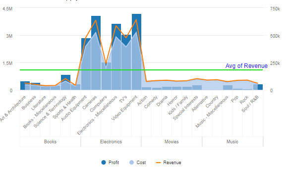
16. Stacked Bar and Column Charts
18.9 Show hide the number of children in a row group:
22.5 Show hide the number of children in a row group:
Section II: Configuration Options
33. Custom fonts in Vitara Charts
34. Plot lines/Reference lines
34.1 Thresholds based on ‘Plot Lines/Reference Lines’:
35.1 VI Dashboards or Dossiers
35.2 Report Services Documents.
A. Disable edit button using User Privileges.
B. Disable edit button using File Permissions:
36. Attribute selectors in report services documents
37. Metric suffixes used to shorten high numbers in axis labels
39. Right to Left (RTL) language support:
39.2 RTL in Grid and Micro Charts:
39.3 RTL in all other Vitara Charts:
43. Drilling in charts
VitaraCharts release 4.1 is a visualization plugin that can be applied on MicroStrategy platform to get access to best of breed charts and widgets from D3, HighCharts and Google Charts for end users which are fully configurable and production ready without the need for any custom coding.
In the case of an MSTR report services documents, the ‘Incremental Fetch’ option will be in enabled mode by default. This divides large data into pages. The default number of rows in a page is set to 50.
But when we apply a custom chart to a grid in MSTR documents, the custom chart will be plotted for the data on the first page only i.e for 50 rows. To avoid this and to plot the custom chart for entire data we have to DISABLE the "Incremental Fetch" option.
Vitara charts support attributes in rows and metrics in columns format only. Please DO NOT apply attributes in columns or metrics in a row.
Download the zip file provided by Vitara and unzip to the plugins folder in the MicroStrategy Web installation. (under <Microstrategy Web Folder>\plugins)
To deploy the Mobile version, download the zip file of Vitara Charts mobile package, unzip the package and copy all the folders in the MicroStrategy Mobile installation. (under <Microstrategy Mobile Folder>\plugins).
Vitara Charts Package can be installed on MicroStrategy version 10.3 or higher on MicroStrategy certified configuration of web servers and has been tested on browsers certified by MicroStrategy’s release.
All the custom visualizations in the package will work in web-based MicroStrategy Documents as well as the Visual Insights Dashboards. All the custom visualizations are currently configurable in documents while the VI dashboard configurability supported from MicroStrategy version 10.3 or higher. The following section in the document showcases the visualizations that are available as a part of the release 4.1.
Vitara offers a headline KPI number and a smaller font number to show change or past performance (for instance, for representation change from the previous quarter). This visualization is ideal for representing key figures that need to be highlighted in VI Dashboards and Documents alike.
Metrics - 3 Metrics, min 1 required. The first metrics M1 will be shown as the big number (Main label) and the second metric M2 will be shown as the smaller number (Sublabel). The third metric M3 will be used to create thresholds for background colors. Metrics can be regular or derived metrics and can be formatting as %, Fixed, Currency, etc.
Attributes - Optional
Use as Filter Option - Not available
The screenshot below showcases the KPI widgets formatted with different colors of text and also using metric values formatted as currency and % respectively. By default KPI widget will show the name of the first metric (Main label) as the title of the widget, but we can modify this with our own text input in Appearance → Text Label → Label-text input box.
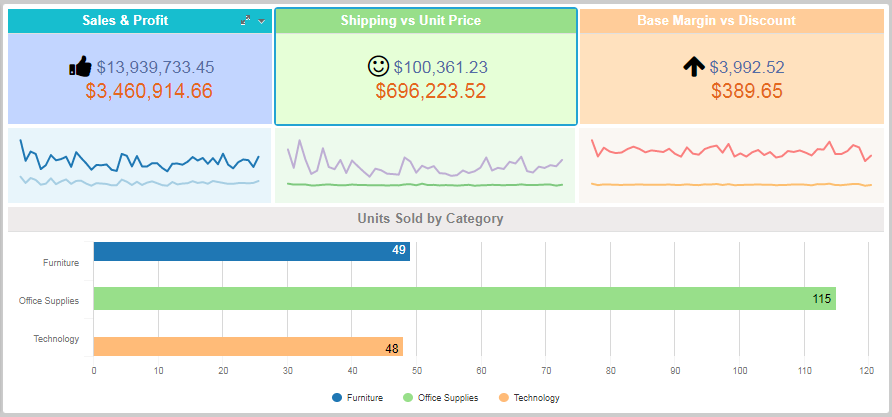
KPI widgets can be effectively combined with VitaraCharts’ Sparkline to show the trend of the key number for the executive dashboard. See the example below.
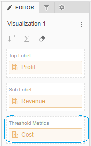
You can apply thresholds to set panel colors and icons in the KPI widget. For Simple KPI chart, in the editor panel of a dossier, apart from the ‘Top Label’ and ‘Sub Label’ drop zones, there is a third metric drop zone called ‘Threshold Metric’ which will be used specifically for applying thresholds in Simple KPI chart.
Open the property editor by clicking on the ‘Edit’ button and select the ‘Threshold’ tab. In the threshold, the editor window applies source, target, threshold condition, and other related information. In the below screenshot, for Simple KPI charts panel colors and icons are set using thresholds.
The steps to set a background image for Vitara charts are explained in section 30.
1.4 Small Multiple:
KPI Widget supports Small Multiple features. Small Multiples concept is explained in section 42.
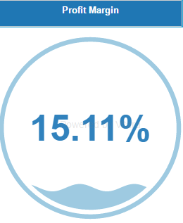
Gauges are extremely popular with the business to represent key measurements. They usually show a single critical performance measurement and take a prominent place on the dashboard. VitaraCharts’ custom gauges have animated views to improve the aesthetics and also immediately draw the user’s attention to the KPI. Below is an example of a VI dashboard built using Vitara’s custom visualizations including the animated gauge.
Metrics - 2 metrics required. Metric 1, M1 will be the numerator and Metric 2 M2 will be the denominator making the displayed value as M1/M2 as a percentage.
Attribute - Optional
Use as Filter Option - Not available
The screenshot below displays the Profit Margin as a percentage value. The default color shown is blue on a white background but can be altered as desired for gauge or background.
If you already have a single metric formatted as a percentage M1 a derived metric sum(1) to be used as M2 input.
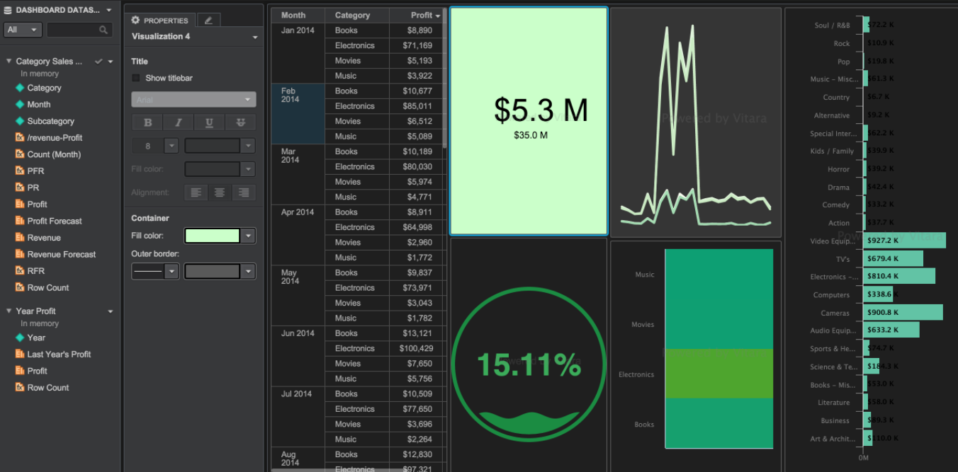
An example dashboard showing various VitaraCharts elements. Note that the dashboard below has been formatted to have a dark theme.
Based on the ratio of the two metrics we can apply thresholds on ring, wave or on the background of the chart. Hover the cursor on the chart, Click on the ‘Edit’ button and select the ‘Thresholds’ option in the properties window.
We can set a background image for this chart. Please see section 30 to know the process of how to set the background image.
A heatmap is a graphical representation of data where a metric is represented at the intersection of 2 attribute values. VitaraCharts’ custom table heatmap allows you to place multiple attributes on the columns (axis and y-axis) and at a glance display the variations in the measures. A sample table heatmap is presented below.
Metrics: The minimum 1 metric is required.
Attributes: A minimum of 2 attributes are required. The first attribute A1 is used for the x-axis and the second attribute A2 is used for the Y axis.
Use as Filter Option - Available
Thresholds Option - Available
We can set thresholds on metrics using any criteria to show specific colors on the chart. Open the property editor by clicking on the ‘Edit’ button and select the ‘Threshold’ tab. In the threshold, the editor window applies source, target, threshold condition and the other related information to set a threshold on any metric.
The steps to set a background image for Vitara charts are explained in section 30.
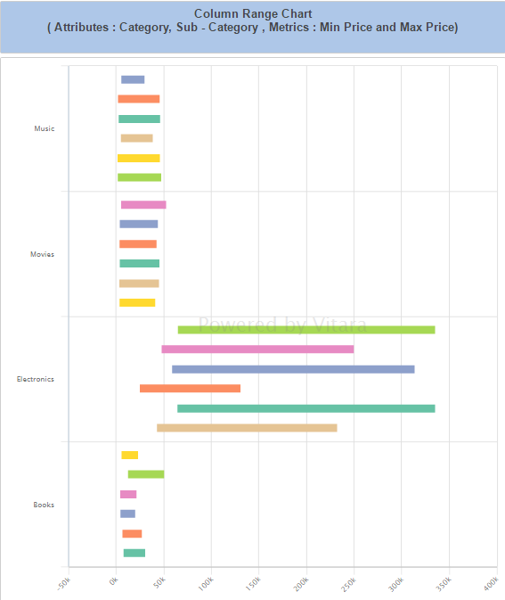
VitaraCharts Column Range Chart visualization can be used to represent minimum and maximum values across time or showcase the acceptable range of deviation for a specific category. Alternatively, it can be used to represent project timelines start date and end date. This representation is ideal for non-aggregatable metric representation like a stock on hand at various times as well.
Attributes: Level 1 attribute is required and optionally level 2 attributes can also be added. These attributes are used on the x-axis.
Metric: 2 Metrics start value M1 and End Value M2 will need to be provided. Metric is used on the Y-axis.
Use as Filter Option - Available
We can set thresholds on metrics using any criteria to show specific colors on the chart. Open the property editor by clicking on the ‘Edit’ button and select the ‘Threshold’ tab. In the threshold, the editor window applies source, target, threshold condition and the other related information to set a threshold on any metric.
In column range chart we can enable play by animation. Please see the section 29 for details about the play by animation.
The steps to set a background image for Vitara charts are explained in section 30.
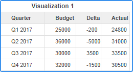
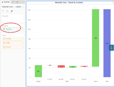
A waterfall chart is a form of data visualization that helps in understanding the cumulative effect of sequentially introduced positive or negative values. If the values are not defined ahead of time or variable i.e. Starting Budget, Quarterly spend (YTD), Remaining Budget is a good example where the number of quarters elapsed cannot be predetermined at build time. Vitara offers a variation of the waterfall widget which includes a starting metric and cumulative sum of all the subsequent metrics finally shows a total bar.
There are two drop zones for the attribute. The ‘group by’ drop zone and ‘break by’ by drop zone. You can drop an attribute in ‘break by’ drop zone if you want to show the metric break up over attribute elements.
The chart enables plot options based on individual metrics. The property editor displays a list of metrics, each metric can be expanded to choose plot options for that metric. We have an option Non-Additive, where we cannot include the starting value in the total value and Auto compute total option, where we can disable the total value in the chart.
Attributes - Optional. If we want to show the metric in the form of ‘break by’ or ‘group by’ then we need attributes. The corresponding values of the metric for each attribute element will be shown in incremental order.
Metrics- A minimum of 2 metrics are required. The first Metric M1 is used as the starting value, the second metric M2 corresponding to each attribute is used to add or subtract from the starting value. The last bar (Total) represents the cumulative sum of metric M1 and metric M2.
Use as Filter Option - Not available
In the example below the group by and break by features are explained using the following data.
Break by: If we drop quarter attribute in ‘break by’ drop zone, by default chart will take the first value of the first metric as start value. If we want we can change it to total or last value also. The second metric will show in the break by the format of a quarter attribute. In our example, the quarterly values of Delta metric are added/subtracted in 4 steps of Q1, Q2, Q3, and Q4. The third metric will be a cumulative sum to the first and second metrics. The default function for the third metric is total. We can apply a break to individual metrics also.
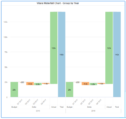
Group by: When we put an attribute in the group by Dropbox, for every element of the attribute an individual chart will be drawn. To the above example, the year attribute is added to the group by drop zone. The year attribute has two elements 2015 and 2016. Now the chart will show the results grouped by year attribute i.e.quarterly information for 2015 and quarterly information for 2016.
The steps to set a background image for Vitara charts are explained in section 30.
5.3 Small Multiples
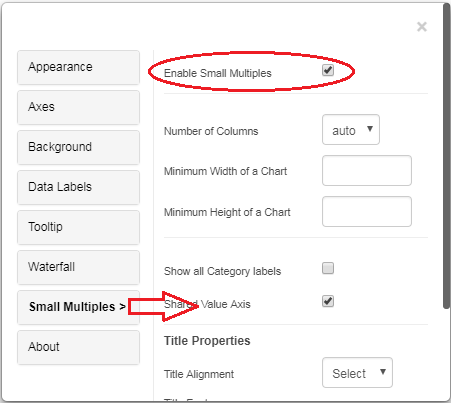
In 4.1. a version of Vitara charts, waterfall chart by default enables small multiple features when we apply an attribute in ‘Group by’ drop zone.
To disable small multiple open property editor by clicking on the ‘Edit’ button. Below is the screenshot of the property editor.
Disable the checkbox ‘Enable Small Multiples’.
Small multiples feature is explained in the section 42 in detail.
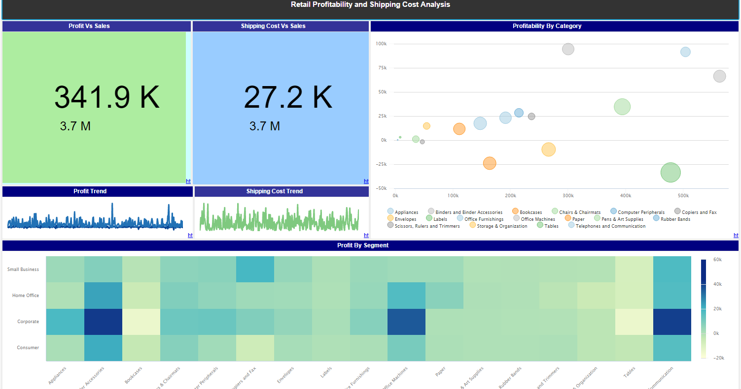
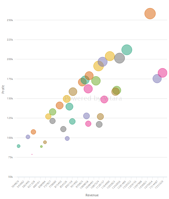
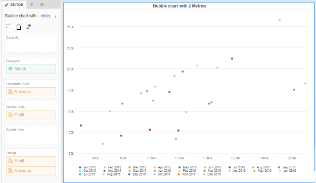
A Bubble chart is a type of chart that displays three dimensions of data. The size of the bubble, the color of the bubble and the location can all be used to represent information in an intuitive manner.
Metrics - 3 metrics are required. The first metric M1 is used for X-axis, the second metric M2 is used for Y-axis and the third metric M3 is used to determine the size of the bubble.
Attributes - 1 or more attributes are required to determine the context for the metric values. In the example below, Revenue(M1), Profit(M2), Profit Margin (M3) are plotted across Month.
Use as Filter Option - Available
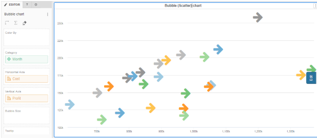
We can use a bubble chart with 2 metrics also. In this case, the bubble chart will work as a scatter chart where the size of the bubbles will not vary. The first metric M1 is used for X-axis, the second metric M2 is used for Y-axis.
6.2 Marker
When the bubble chart is working as a scatter chart with only two metrics M1 & M2, the type of the marker and the size of markers are customizable.
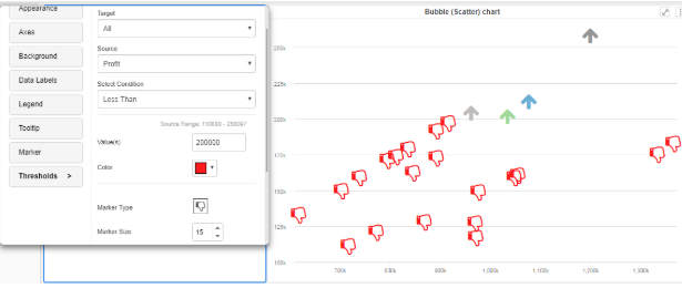
We can set thresholds on metrics using any criteria to show specific colors on the chart. Open the property editor by clicking on the ‘Edit’ button and select the ‘Threshold’ tab. In the threshold, the editor window applies source, target, threshold condition and the other related information to set a threshold on the chart.
When the chart is working as a scatter chart, thresholds can also set the type of marker to display when the condition is true. In the below screenshot a threshold with markers is set on profit with a condition less than 200K.
In the bubble chart, we can apply the ‘play by’ feature. For more details about ‘play by - animation’ please refer section 29.
The steps to set a background image for Vitara charts are explained in section 30.
6.6 Small Multiples
bubble chart supports Small Multiple features and is explained in the section 42.
Vitara’s spacer can be added to create space between visualizations and adjusted for size to get the required look and feel for the VI dashboard. A sample dashboard is shown below with a spacer at the title area as well as in between two visualizations.
At Least one metric or attribute needs to be provided for the visualization.
Use as Filter Option - Not available
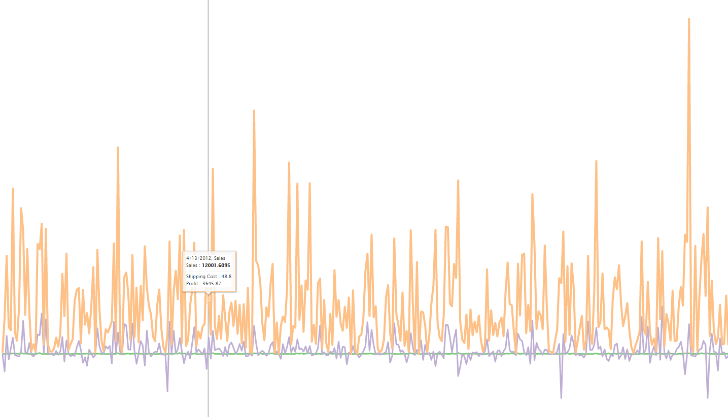
A Sparkline is a small chart that is aligned with rows of some tabular data and usually shows trend information. Sparklines (often called as micro-charts) add rich visualization capability to tabular data without taking too much space.
Metrics - 1 or more metrics can be added to this visualization
Attributes - Minimum one attribute is required. We recommend adding one time-based attribute as a trend over time is best represented by a sparkline. However, any other attribute can also be used.
Use as Filter Option - Available
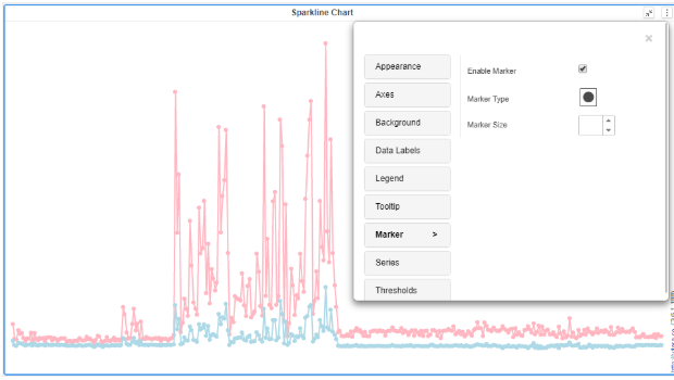
We can add a marker at each data point on the spacer chart. There are various markers available to select from. Go to the marker tab, click on the marker type, select the marker. The size of the markers is also customizable. Just enter a number in ‘Marker Size’ text input box or you can use increase/decrease buttons.
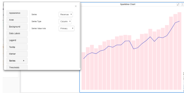
We can turn the sparkline chart into the combinational chart by changing the series type in the series tab.
We can set thresholds on metrics using any criteria to show specific colors on the chart. Open the property editor by clicking on the ‘Edit’ button and select the ‘Threshold’ tab. In the threshold, the editor window applies source, target, threshold condition and the other related information to set a threshold on the chart.
‘Play by - Animation’ is a unique feature of Vitara charts, and we can apply this in the sparkline chart. Please refer section 29 for more details about ‘play by - animation’.
The steps to set a background image for Vitara charts are explained in section 30.
Tornado diagrams or charts are a special type of Bar chart, where the data categories are listed vertically instead of the standard horizontal presentation, and the categories are ordered so that the largest bar appears at the top of the chart, the second largest appears second from the top, and so on when sorted descending. They are so named because the final chart visually resembles either one half of a complete tornado. They are ideal for representing 2 values that need to be compared across any dimension.
Metrics: 2 metrics are required.
Attributes: 1 or more attributes are required.
Use as Filter Option - Available
In the example below Profit and Profit Forecast are represented by the bars over time attribute Month. Also, the chart below is sorted by Profit in descending order in the editor section.
We can make the sparkline chart as a combinational chart by changing the series type in the series tab. Instead of a bar, we can make a chart to show either line/area/column/scatter.
In the case when tornado chart series is changed to either line/scatter/area, we can change the marker to any shape listed in ‘marker type’ in the ‘marker’ tab.
We can set thresholds on metrics using any criteria to show specific colors on the chart. Open the property editor by clicking on the ‘Edit’ button and select the ‘Threshold’ tab. In the threshold, the editor window applies source, target, threshold condition and the other related information to set a threshold on the chart.
For more details about ‘play by - animation’ please refer section 29.
The steps to set a background image for Vitara charts are explained in section 30.
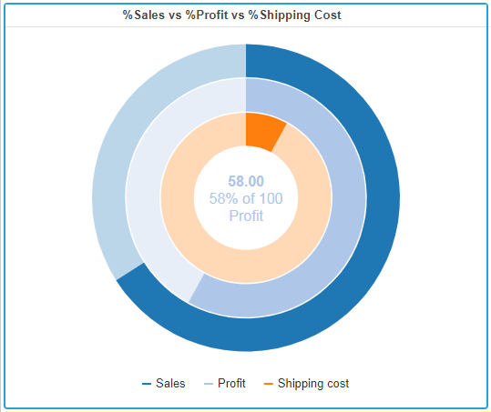
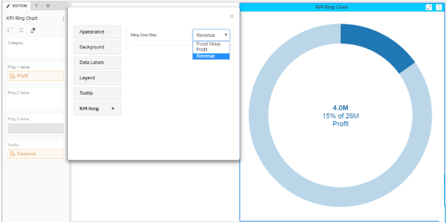
The KPI Ring is a set of concentric donuts that can be used to represent KPIs in a very compact representation that makes them easy to compare.
Metrics - Minimum 1 metric required. We can add up to 3 metrics M1, M2 and M3 each representing a percentage value to be shown in the KPI ring circle.
Attributes - Optional.
Use as Filter Option - Not available
In the example below showcases the output of the KPI ring circle with the header.
We can compare 2 metrics M1 and M2, like, how much percentage contribution of M1 in M2. For example, if I want to show, what is the percentage of profit out of total revenue generated?
The steps to set a background image for Vitara charts are explained in section 30.
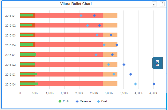
A bullet chart is a variation of a bar graph developed by Stephen Few. Seemingly inspired by the traditional thermometer charts and progress bars found in many dashboards, the bullet graph serves as a replacement for dashboard gauges and meters. Bullet graphs were developed to overcome the fundamental issues of gauges and meters: they typically display too little information, require too much space, and are cluttered with useless and distracting decoration. The bullet graph features a single, primary measure (for example, current year-to-date revenue), compares that measure to one or more other measures to enrich its meaning (for example, compared to a target).
Metrics- At Least 2 metrics are required for this visualization to be meaningful. A base Metric M1, a target M2. Additional target metrics M3, M4, etc can be added as shown below.
Attributes - 1 or more attributes can be included.
Use as Filter Option - Available
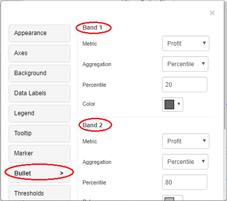
Bullet chart plot bands can be defined based on metric aggregations, similar to bullet chart type in Vitara Micro Chart. By default, the bullet chart will plot 3 bands based on ‘percentile’ function on the metric applied in the ‘Bar’ drop zone.
We can edit these default bands and can apply different aggregation functions for different bands. As shown in the below screenshot hover the cursor on the chart, click on the ‘Edit’ button to get a properties popup window.
We can set thresholds on metrics using any criteria to show specific colors on the chart. Open the property editor by clicking on the ‘Edit’ button and select the ‘Threshold’ tab. In the threshold, the editor window applies source, target, threshold condition and the other related information to set a threshold on the chart.
Play by - animation shows the chart for each element of the first attribute. For more details about the play by feature please refer section 29.
The steps to set a background image for Vitara charts are explained in section 30.
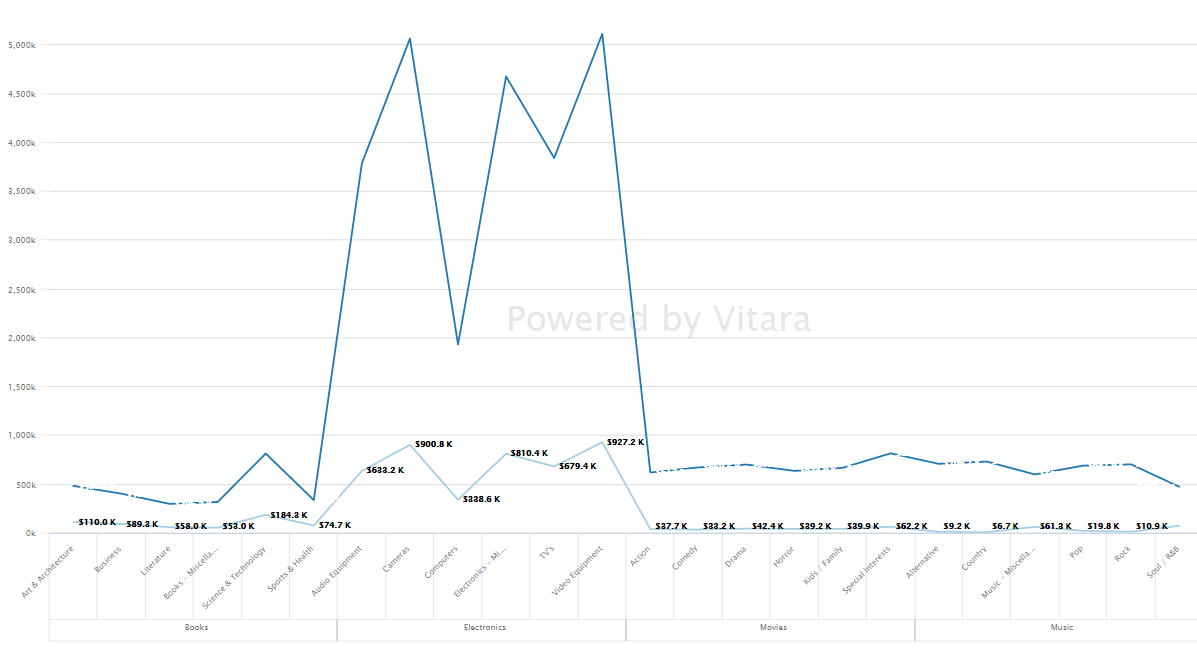
A line chart or line graph is a type of chart that displays information as a series of data points called 'markers' connected by straight line segments. It is a basic type of chart common in many fields.
Metrics - 1 or more metrics can be used
Attributes - 1 or more attributes can be used.
Use as Filter Option - Available
Line chart:
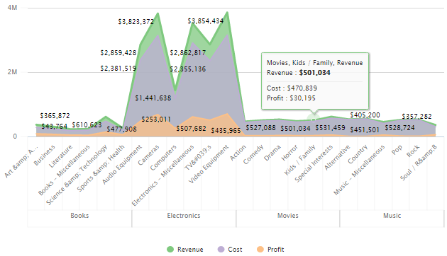
Area chart:
We can add a marker at each data point on the line/ area chart. There are various markers available to select from. Go to the marker tab, click on the marker type, select the marker. The size of the markers is also customizable. Just enter a number in ‘Marker Size’ text input box or you can also use increase/decrease buttons.
We can turn the line/area chart into the combinational chart by changing the ‘series type’ in the ‘series’ tab.
We can set thresholds on metrics using any criteria to show specific colors on the chart. We can also include markers in thresholds. Open the property editor by clicking on the ‘Edit’ button and select the ‘Threshold’ tab. In the threshold, the editor window applies source, target, threshold condition and the other related information to set a threshold on the chart.
Please refer section 29 for more details about ‘play by - animation’.
The steps to set a background image for Vitara charts are explained in section 30.
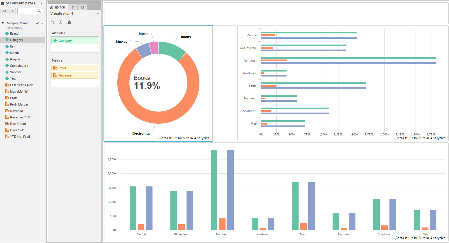
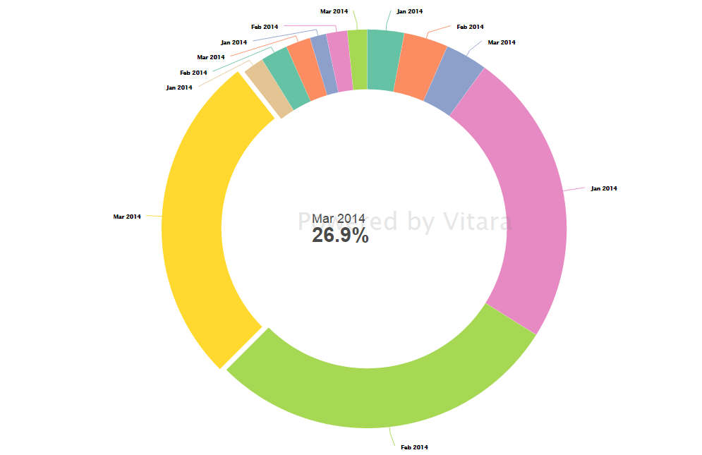
The Donut chart is a Pie chart variation with the ability to display a single series of data in a two-dimensional circle. It is useful for displaying data as parts of a whole.
Metrics - 1 metric
Attributes - 1 or more attributes. For each combination of attribute elements, one slice will be created. For example in the screenshot below for every combination of Month and Category, a slice is created.
Use as Filter Option - Available
The pie chart also has ‘play by - animation’ property. Please refer section 29 for the detailed instructions about this feature.
The steps to set a background image for Vitara charts are explained in section 30.
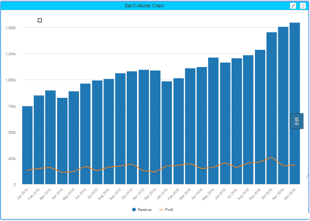
A bar chart or bar graph is a chart that presents grouped data with rectangular bars with lengths proportional to the values that they represent. The bars can be plotted vertically or horizontally. A vertical bar chart is sometimes called a column bar chart. In VitaraCharts, users will separate icons for horizontal and vertical charts and users will need to switch as needed.
Metrics - 1 or more metrics
Attributes - 1 or more attributes
Use as Filter Option - Available
We can turn the bar/column chart into the combinational chart by changing the ‘series type’ in the ‘series’ tab.
We can set thresholds on metrics using any criteria to show specific colors on the chart. We can also include markers in thresholds. Open the property editor by clicking on the ‘Edit’ button and select the ‘Threshold’ tab. In the threshold, the editor window applies source, target, threshold condition and the other related information to set a threshold on the chart.
All the details about ‘Play by - Animation’ are mentioned in section 29.
The steps to set a background image for Vitara charts are explained in section 30.
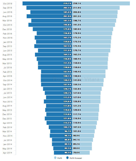
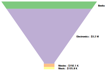
Funnel charts allow analysts to visualize the percent contribution of a metric’s data in a dimension.
For example, the following funnel chart displays the percentage contribution of Profit by Category. Each section of the funnel is a different category, and the size of each section is proportional to the amount of profit that the category contributed.
Metrics - 1 or more metrics
Attributes - 1 attributes
Use as Filter Option - Available
Drag and drop a metric in the ‘play axis’ drop zone. The chart will play by as per the elements in the attribute in the ‘play axis’ drop zone. For more details about ‘play by - animation’ refer section 29.
The steps to set a background image for Vitara charts are explained in section 30.
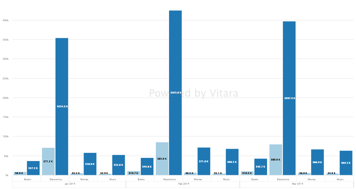
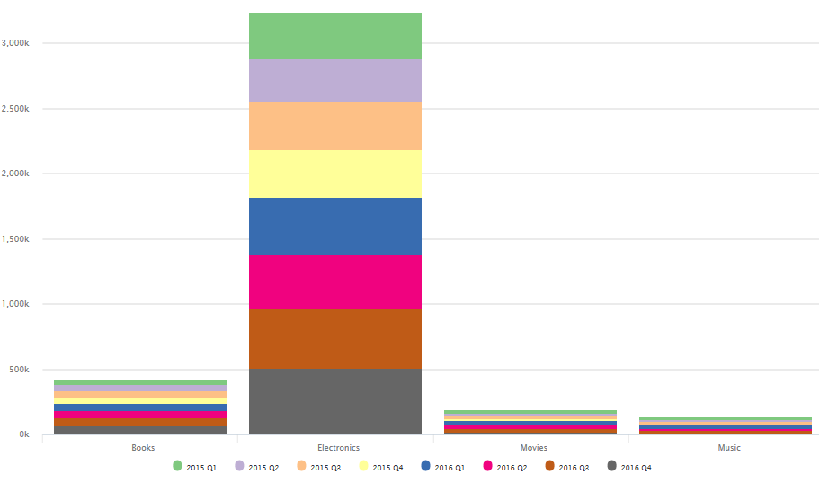
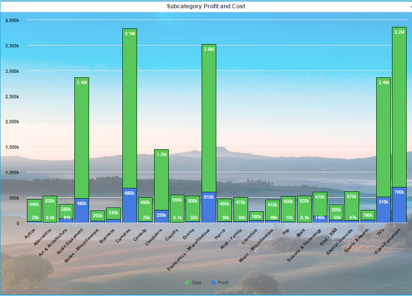
Unlike conventional bar and column charts where a separate bar/column is displayed for each element of the attribute, in stacked bar/column charts the second attribute groups on the first attribute.
In the below-shown example, there are 2 attributes: Category and Quarter. The quarter attribute is grouped on category attribute; as a result, for each element of the Category attribute all the quarter attribute elements are displayed one above the other.
Metrics: 1 metric
Attribute: At least 2 attributes.
Use as Filter Option - Available
We can set thresholds on metrics using any criteria to show specific colors on the chart. Open the property editor by clicking on the ‘Edit’ button and select the ‘Threshold’ tab. In the threshold, the editor window applies source, target, threshold condition and the other related information to set a threshold on the chart.
The steps to set a background image for Vitara charts are explained in section 30.
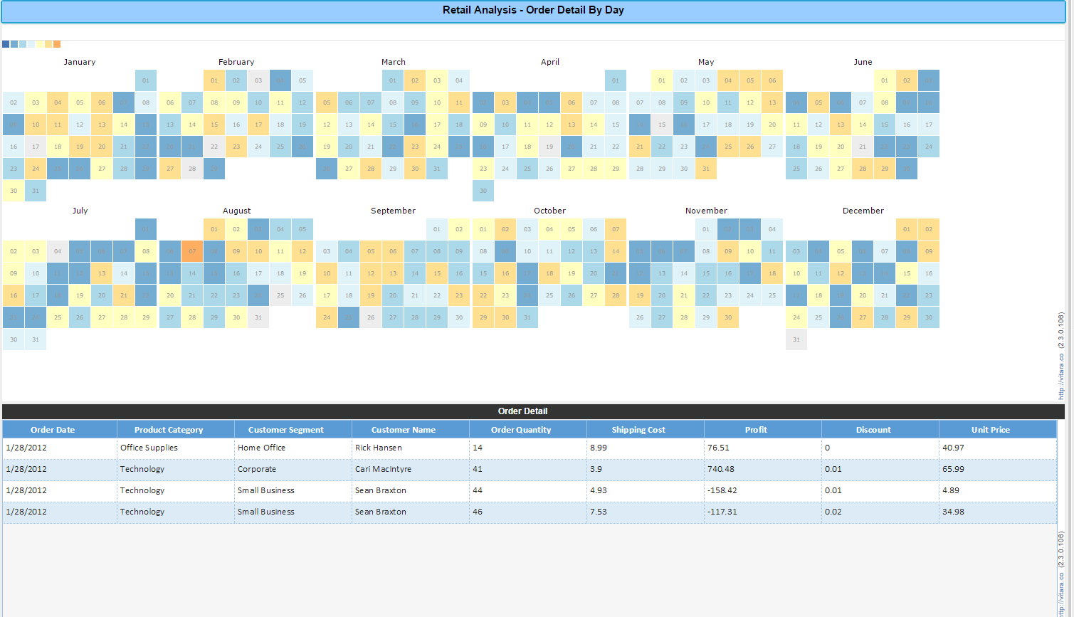
The calendar heat map shows time series data using color gradients. We can make a chart to show day, week, month and year wise data.
Metrics: 1 metric
Attributes: At Least one date attribute.
Use as a filter option - available.
In the example below, the data is at the day level and shown by the grain Month. The calendar days are color coded by sales values and the bottom grid is controlled by the calendar widget.
The level of display in the calendar can be changed to show year-week, month-day, year-month, etc as needed.
We can set thresholds on metrics using any criteria to show specific colors on the chart. Open the property editor by clicking on the ‘Edit’ button and select the ‘Threshold’ tab. In the threshold, the editor window applies source, target, threshold condition and the other related information to set a threshold on the chart.
The steps to set a background image for Vitara charts are explained in section 30.
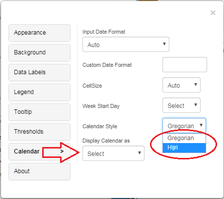
The following screen demonstrates the process of enabling the ’Hijri’ format in the calendar heatmap.
Note : A separate detailed usage document is available for Grid and MicroChart.
Vitara grid is the most user-friendly grid. We can explore so many features with just a click. Grid formatting is available at both at column level and row level, attractive grid themes, apply to group (Page by) at multiple levels, metric aggregations (Subtotals) at different grouping levels, column grouping, thresholds with custom icons, and many more.
Metrics: 1 metric
Attributes: At least 1 attribute
Use as Filter Option - Available
Using the Vitara grid chart it’s so easy to apply the following options.
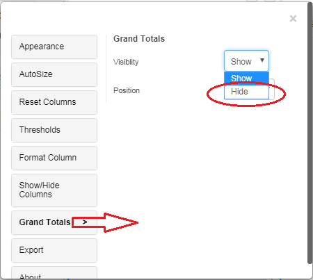
By default grid chart will show ‘Grand Total’ for all the metrics in the chart. To disable/hide
‘Grand Totals’ click on the ‘Edit’ button select the ‘Grand Totals’ tab then expand the ‘Visibility’ dropdown button to select the ‘hide’ option. Please refer the below screenshot.
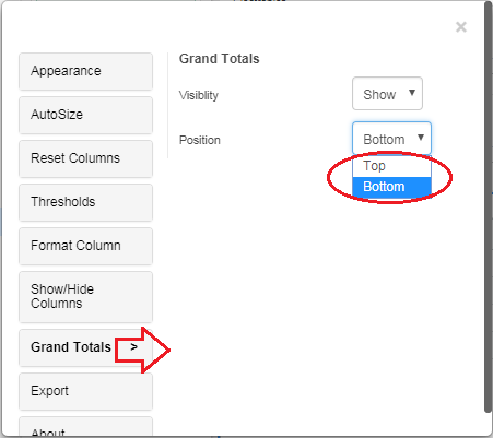
Starting from 4.1 release we can make the ‘Grand Totals’ row to display on the top of the grid or at the bottom of the grid.
Click on the ‘Edit’ button to open the properties window then select the ‘Grand Totals’ tab and expand the dropdown button ‘Position’ to select the ‘Top/Bottom’ option. Please refer the below screenshot.
We can apply to the group, both at column level and row level. Expand/collapse grouping. For group headlines, we can apply aggregations. Further, we can show grand totals for grouped metric aggregated headlines.
We can show aggregations (Subtotals) on groupings. Enable or disable grand totals.
Apply/remove thresholds easily. In thresholds, we can set the background color, text color, icons, icon color, icon size, icon only and use custom images as icons.
With just a click on the column header will sort the column data in ascending or descending order. On the first click data will be sorted in ascending order, the second click will sort in descending order and the third click will remove sorting on a column. ‘Clear sorting’ tab also available which will clear sorting applied on all columns in the grid.
Auto size fit to the content/ fit to grid width, grid themes, set grid row height, option for clear sorting/clear threshold/clear grouping/clear filter, export grid data into CSV format, pin a column to the right/left side.
Text font properties like font style, font size, alignment, text color, bold, underline and italic are available for column headers and body text.
View filters can be created specifically to the grid i.e filter on attribute or metric.
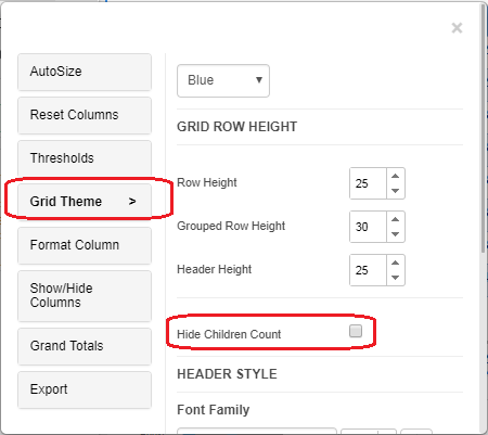
In 3.8 release Grid/Micro chart introduced an option to show or hide the number of children in a row group. Grid/Micro charts have an option to show or hide the number of children in a row group. Click on the ‘Edit’ button, in properties popup window select ‘Grid Theme’ and check the ‘Hide Children Count’ checkbox.
The trellis chart shows a graph for each element of the first attribute. We can change the graph type to line or bar or column or scatter.
Metrics: 1 metric
Attributes: 2 attributes
Use as Filter Option - Available
Option to set chart type - line, column, bar or scatter. We can set a number of columns to show the subgraph for each element of the first attribute.
If the chart type is selected as a line, then we can set markers at every data point.
We can turn the line/area chart into the combinational chart by changing the ‘series type’ in the ‘series’ tab.
We can set thresholds on metrics using any criteria to show specific colors on the chart. Open the property editor by clicking on the ‘Edit’ button and select the ‘Threshold’ tab. In the threshold, the editor window applies source, target, threshold condition and the other related information to set a threshold on the chart.
The steps to set a background image for charts are explained in section 30.
Vitara’s Word Cloud chart shows attribute elements on the chart, and the elements which have larger metric values will be shown in bigger sizes. Vitara Word cloud allows you to modify colors, size of the text.
Metrics: 1 metric
Attributes: At least 1 attribute.
Use as Filter Option - Available
We can set thresholds on metrics using any criteria to show specific colors on the chart. Open the property editor by clicking on the ‘Edit’ button and select the ‘Threshold’ tab. In the threshold, the editor window applies source, target, threshold condition and the other related information to set a threshold on the chart.
The steps to set a background image for Vitara charts are explained in section 30.
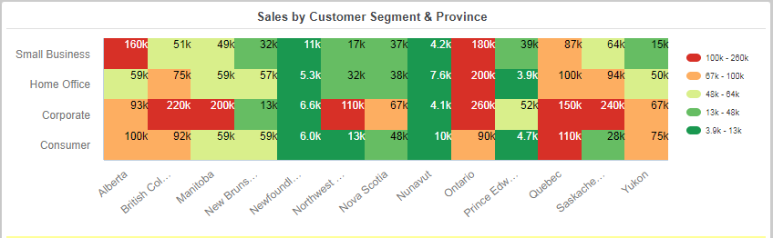
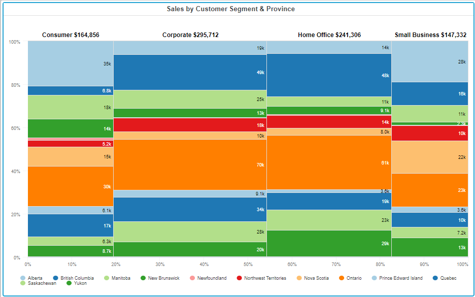
The Mekko chart shows data using a two-dimensional axis. It is similar to the stack bar chart but additionally, it shows the relativity among the different stack categories with the increased or decreased width. This will help in identifying the contribution of a particular category.
Metrics: 1 metric
Attributes: 2 attributes.
Use as Filter Option - Available
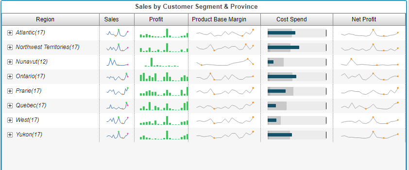
Example: Mekko chart with Sales by Customer Segment & Province values. The width of each Customer Segment will represent the contribution of that Province to overall sales.
We can set thresholds on metrics using any criteria to show specific colors on the chart. Open the property editor by clicking on the ‘Edit’ button and select the ‘Threshold’ tab. In the threshold, the editor window applies source, target, threshold condition and the other related information to set a threshold on the chart.
The steps to set a background image for Vitara charts are explained in section 30.
Note : A separate detailed usage document is available for Grid and MicroChart.
The Micro chart consists of compact representations of data that allow analysts to quickly visualize trends in data. Microcharts convey information so that a user can, at a glance, determine the trend of a metric over time or how a metric is performing compared to forecasted figures.
Metrics: At Least 1 Metric.
Attributes: 2 attributes.
The chart will apply a group by to the first attribute. On expanding the group by of the first attribute elements, the details of the second attribute will be displayed. We cannot ungroup the first attribute.
By default, for all the metrics, the line chart will be displayed as a trending chart in the group by headers.
Use as Filter Option - Available
Example: Showing Sales by region and subcategory in a micro chart by using trending chart options.
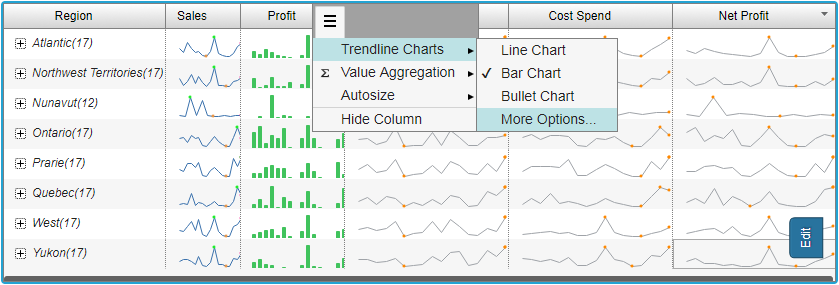
By default line chart with markers at the minimum value, maximum value and final value will be displayed. We can change trending charts as bar chart or bullet chart. We can change the default colors of these chart by selecting ‘More Options’ in ‘Trendline Charts’ tab.
We can also make to display just aggregated value instead of any trending chart, by applying any of the aggregation functions available. When we apply value aggregation to a particular metric column, a grand total of all groups by headers for that particular metric column will be displayed at the bottom of the chart.
Grid theme - fresh, white, dark, blue, bootstrap; grid row height, header, and body text style properties, auto-size - fit this column to content, fit all columns to content; fit all columns to grid width.
In 3.8 release Grid/Micro chart introduced an option to show or hide the number of children in a row group. Grid/Micro charts have an option to show or hide the number of children in a row group. Click on the ‘Edit’ button, in properties popup window select ‘Grid Theme’ and check the ‘Hide Children Count’ checkbox.
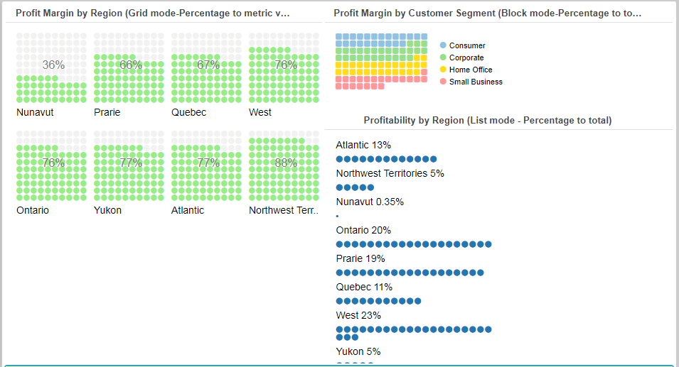
Waffle charts are also called square pie charts and display progress towards the goal. Vitara Waffle chart will work in the following modes: block (Percentage to total), list (Percentage to total), grid (Percentage metric value).
Metrics: 1 metric
Attributes: 1 attribute.
Use as Filter Option - Available
The screenshot below showcases all the three modes of waffle chart.
We can choose from different types of markers available in the ‘Marker’ tab of the waffle chart. The size of the marker is also customizable.
The steps to set a background image for Vitara charts are explained in section 30.
A histogram is used to classify (continuous) values of a metric into specific bins. It is a graphical display of data using bars of different heights. It is similar to a Bar Chart, but a histogram group metric values into ranges (bin size) and you can decide what ranges to use. The bin size can be set as per the requirement. We can also show the cumulative sum line of the values under each bin.
Metrics: 1 metric
Attributes: 1 attribute.
Use as Filter Option - Not Available
When the Vitara histogram chart shows the cumulative sum line, we can make a chart to show a marker at each intersection of each bin and the cumulative sum line. The type and size of the marker customizable.
The steps to set a background image for Vitara charts are explained in section 30.
Dumbbell charts are an alternative visualization choice for illustrating the change between two data points. The chart can also show the difference between the two data points in the form of a percentage.
Metrics: 2 metrics
Attributes: 1 attribute.
Use as Filter Option - Available
We can set thresholds on metrics using any criteria to show specific colors on the chart. We can also include markers in thresholds. Open the property editor by clicking on the ‘Edit’ button and select the ‘Threshold’ tab. In the threshold, the editor window applies source, target, threshold condition and the other related information to set a threshold on the chart.
The steps to set a background image for Vitara charts are explained in section 30.
The slope graph represents a change in the value of a metric for a given attribute value over time.
So each (sloping) line is represented by two points; one at the starting value of time and others at the ending value of time.
When more than two values of time are provided, all points are plotted as in a line chart.
A label showing percentage variation between two consecutive points is displayed(optional) along the slope-line joining the points.
Metrics: 1 metric.
Attributes: 2 attributes.
One attribute must be the time that is plotted along the x-axis. The second attribute is used to categorize input data.
Use as Filter Option - Available
We can set thresholds on metrics using any criteria to show specific colors on the chart. We can also include markers in thresholds. Open the property editor by clicking on the ‘Edit’ button and select the ‘Threshold’ tab. In the threshold, editor window apply source, target, threshold condition and the other related information to set a threshold on the chart.
At the starting value point and ending value point, the marker is displayed. These markers type and size are customizable.
The steps to set a background image for Vitara charts are explained in section 30.
Packed Bubble charts will display data in a cluster of circles. Attributes define the individual bubbles, and values define the size of the individual circles. Click on any bubble by holding the Shift button, that particular bubble will zoom in to show detailed information.
Metrics: 1 metrics
Attributes: 1 attribute.
Use as Filter Option - Available
The steps to set a background image for Vitara charts are explained in section 30.
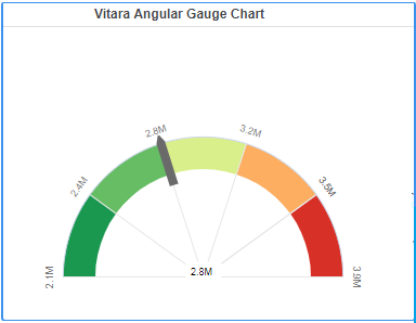
The angular Gauge chart is designed to display specific data using a semicircular shape with the pointer. The semicircular shape is created by defining the lower limit and upper limit, using functions like sum, min, max, count. Within that scale, we can create various color ranges in thresholds to classify the data.
We can make the pointer to indicate the sum/ avg/ min/ max/ count/ first/ last values of the metric over the semicircular shape. Thresholds can also be created on the pointer.
Metrics: 1 or more metrics
Attributes: 1 attribute.
Use as Filter Option - Not Available
The steps to set a background image for Vitara charts are explained in section 30.
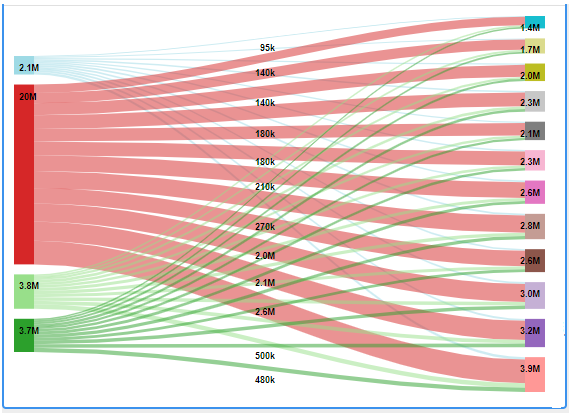
Sankey Chart is designed to represent a flow from one set of values to another. It is the best way to use many-to-many mapping relationships between two dimensions. The things being connected are called nodes and the connections are called Links. Sankey is efficient and is very good showing particular complex information.
Metrics: 1 metric
Attributes: 2 or more attribute
Use as Filter Option - Available
The steps to set a background image for Vitara charts are explained in section 30.
Example
Sankey chart with Cost of Quarter-wise Category values.
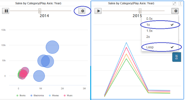
The ‘Play By First Attribute’ option will make Vitara charts to show the chart for each element of the first attribute at a particular time instant. We can pause at any time.
In 3.9 build, there is a new feature with the settings option. In the Play Axis Settings, we have two options.
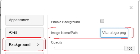
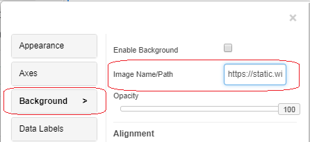
Steps to insert background images for Vitara charts.
The background image can be inserted in two ways:
Step 1: Copy the image which you want to set as a background for Vitara charts in the following folder.
→ Tomcat\webapps\MicroStrategy\plugins\VitaraCharts\custom\images.
Step 2: Open edit popup window, goto background tab, click on “Enable background image” checkbox.
Step 3: Enter the name of the image with the extension (.png or .jpg) into the text box.
Example:
Note: Image name is case sensitive.
Examples:
We have options like - original/fit to chart/fill chart/custom, to make the image to fit with the Vitara chart. The opacity option can reduce the intensity of the background image on the Vitara chart.
Below we can see a screenshot of Stacked Column Chart with a background image.
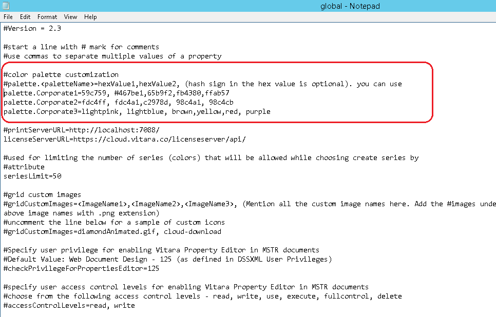
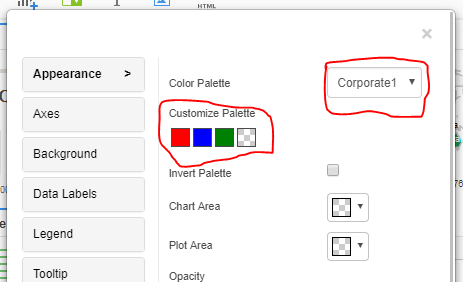
Users can define their own color palettes for Vitara charts.
VitaraCharts provides three color palettes that can be defined as per the customer’s prescribed colors; corporate1, corporate2, and corporate3.
In any of the Vitara chart, go to - edit → appearance → color palette.
Expand the color palette tab, you can see these three color palettes.
We can modify the colors in these color palettes.
Below are the steps to deploy a custom color palette. The changes we do here will reflect into all Vitara charts.
Open the file named ‘global.txt’ is in the following path,
Tomcat 8.0\webapps\MicroStrategy\plugins\VitaraCharts\custom
In this file, you can see the three properties called ‘palette.Corporate1’, ‘palette.Corporate2’ and ‘palette.Corporate3’. Please refer the below screenshot of the ‘global.txt’ file.
You can assign a series of colors as values for these properties. There are examples of color codes in the global.txt file, that can make it easy to understand how to set color values. Valid values include color names, hex values or RGB values.
The colors we give for a particular palette in the ‘global.txt’ file will reflect all Vitara charts - Edit → Appearance → Color Palette → Corporate1/2/3.
Below is the example of a Custom color palette of Corporate1.
palette.Corporate1=red, blue, green
Vitara Charts can show text, like axes labels or data labels or tooltip, in the customer prescribed text font styles. Below are the steps to deploy custom fonts in Vitara charts.
Step 1: Install the font (.ttf file) which you want to deploy in a web server.
Step 2: Copy the font file into
tomcat/webapps/MicroStrategy/plugins\VitaraCharts\style\v370188\fonts.
Step 3: Open ‘customStyle.txt’ file in the folder - plugins\Vitara Charts\custom.
Step 4: Uncomment the first line by deleting /** and **/
Step 5: Delete the line “Uncomment to introduce new font-family and make it available”.
Step 6: Replace the name of the font which you want to add in the “font-family” line.
Step 7: In “src:url” line copy the path of the folder in which we copied the font file.
In the below example ‘Chiangmai Hostel’ font is deployed.
@font-face {
font-family: Chiangmai Hostel;
src: url(../style/v370188/fonts/Chiangmai Hostel.ttf);
}
Step 8: Add the font name in Vitara-chart-container.
.vitara .vitara-chart-container{
font-family:Chiangmai Hostel, Arial, Helvetica, Verdana, sans-serif !important;
}
Refresh your web browser and open Vitara Charts. Below is the screenshot of the custom font in the Vitara chart.
The following charts have Plot lines/Reference lines. Feature: line, area, sparkline, bar, column, stacked bar, stacked column, bullet, tornado, column range, slope, dumbbell, bubble and histogram charts.
Go to the ‘Plot Lines’ tab in the property editor window and select the metric based on which you want to draw plotline in the ‘source’ drop down window.
Apply the conditions like min, max, avg, first, last, and percentile. Apart from these fixed conditions, you can give a particular value as input at which you want to draw a plot line. You can apply colors to plot line, change the plot line width, change the style of the line and title to the plot line. At last click on the ‘Apply’ button.
In 3.8 release, support for plotlines on the vertical axis is added in the bubble chart. Please refer the below screenshot showing plot lines/reference lines on both the horizontal and vertical axes.
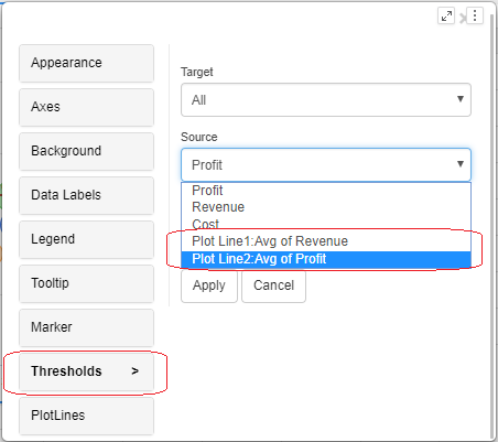
Plot lines/Reference lines can be used in the ‘source’ field in thresholds.
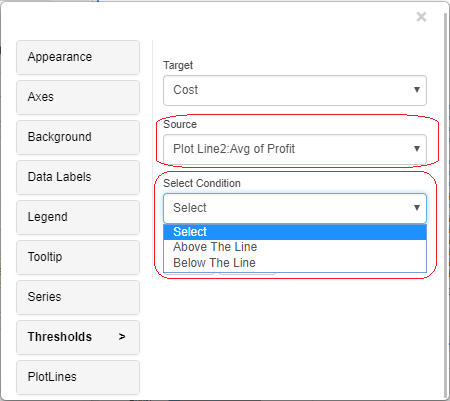
Once we set the plot line in any Vitara chart, the name of the plot line will show up in the source field of the thresholds tab. We can set plot lines as a source in the thresholds. When we set a plot line as ‘Source’ in a threshold we can apply the condition ‘Above the line’ or ‘Below the line’ in the threshold.
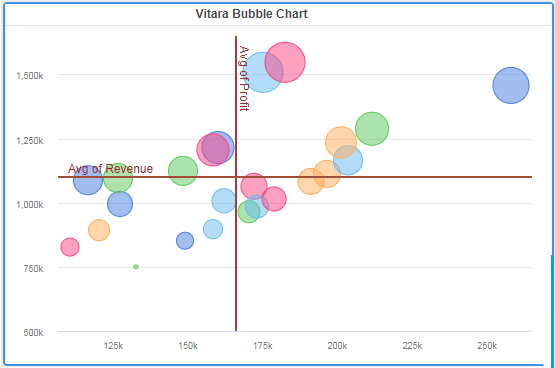
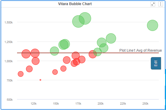
Below is a screenshot of bubble chart in which two thresholds are applied based on the plotline “Plot line1: Avg of Revenue”. The first threshold is based on the condition ‘above the plotline set bubble color as the green color’ and in the second threshold ‘below the plotline set bubble color as red.’
Users can make changes to Vitara Charts using the properties window which will pop up when we click on the ‘Edit’ button. When the user hovers the cursor on any of the charts, Vitara charts will show this ‘Edit’ button. By disabling this ‘Edit’ button we can restrict the end users not to make any changes after the dashboard designer had done his/her work.
When the user runs the VI Dashboard/Dossier in “Presentation Mode” Vitara Charts do not display the ‘Edit’ button.
In MicroStrategy “User Privileges” and “File Permissions” are the two concepts by which we can implement security at different levels of users.
Vitaracharts can be configured using the security model so that only developers or document designers are able to edit the Vitara charts and not the end users. We can allow/restrict a user to edit or modify Vitara charts depending on the privileges or file permissions that the user has in MicroStrategy.
In Vitara Charts the privilege and permission settings are defined in the ‘global.txt’ file, which will be in the Vitara Charts installation folder. Generally, it will be in the following path:
Tomcat 8.0\webapps\MicroStrategy\plugins\VitaraCharts\custom.
The code “#checkPrivilegeForPropertiesEditor=125” in the ‘global.txt’ file will deal with user privileges. In this line, we have to give the DSSXML Privilege value of a particular privilege on which we want to set a security condition. The default value 125 is the DSSXML Privilege value of ‘Web Document Design’ privilege.
Uncomment this line by deleting ‘#’ to set condition using user privilege - ‘Web Document Design’.
Now only the users who have ‘Web Document Design’ privilege enabled will get the edit button for all Vitara charts. You can set this condition using other privileges also. For example, the DSSXML Privilege value for ‘Web Print Mode’ privilege is 27. Give these values in the privilege settings line.
checkPrivilegeForPropertiesEditor=27
The users who this privilege enabled are only able to edit or modify Vitaracharts.
Vitara Charts will inherit the file permissions a user has on a particular report services document and will show the ‘Edit’ button if it matches with the permission set in the global.txt file.
In the ‘global.txt’ file the following code will deal with setting security conditions using file permissions.
#accessControlLevels= read, write
By default, this line will be in commented mode. Uncomment this line by deleting ‘#’ character.
Suppose you want the users who have ‘Write’ permission on a particular document only able to edit Vitara charts, modify the code as follows,
accessControlLevels= write
Now only the users who have to write permission on that particular report services document will get the ‘Edit’ button in Vitara Charts.
For further information about disabling of the “Edit” button in Vitara Charts please refer the document “How to disable ‘Edit’ button in Vitara Charts”.
Reference for Privilege codes
https://docs.google.com/spreadsheets/d/1qTtu79KFs0oddvhQGTrRadmGI0UlpO9FRKrMGkt02KU/edit#gid=0
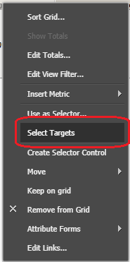
Similar to ‘Use as Filter’ option in VI dashboards, Vitara Charts supports attribute selector feature for Report Services Documents as well.
In the design or editable mode of a document right click on the attribute in the grid which you want to apply filter and select the ‘Select Target’ option.
Select the target chart and click on to apply attribute selector in documents in Vitara charts.
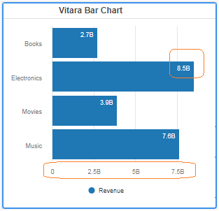
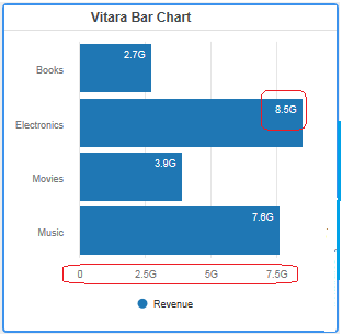
Vitara charts will shorten the number in axis labels and in data labels. The shortened metric suffixes can modify as per the user's requirement.
The following code in the ‘global.txt’ file can be used for this purpose. The ‘global.txt’ file will in the following location in the Vitara charts plugin folder. Vitara charts → Custom folder → global.txt.
#Metric suffixes used to shorten high numbers in axis labels.
#empty-value, space, null is discarded.
shortFormatSymbols=k, M, B, T, P, E
In the above code, ‘k’ is the suffix for 103, M is suffix for 106, B is suffix for 109 and so on. In Vitara Charts we can change this suffix character as per our requirement.
For example, the number 1, 000, 000, 000 or 109 is shortened as 1B by default. If we want to change the suffix ‘B’ to some other character, say ‘G’, in the above code we have to replace ‘B’ with ‘G’.
shortFormatSymbols=k, M, G, T, P, E
Save the ‘global.txt’ file and reopen your document. The below screenshot shows the new suffix ‘G’.
Note: After reloading the dashboard, if you are still having the older suffix in your dashboard, delete your browser’s cache and reload the dashboard.
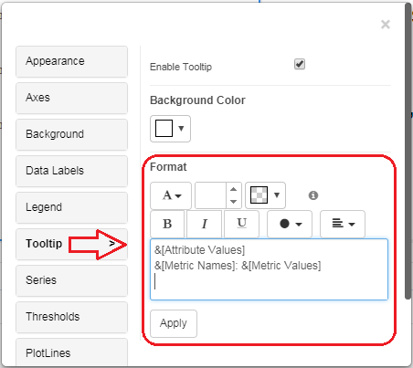
Starting from 3.9 release we can decide what to display in the tooltip of VitaraCharts. The new HTML editor in the “Tooltip” property menu can be used to edit tooltip. Below is the screenshot of the tooltip editor window.
The editor is a lightweight component that supports the following features:
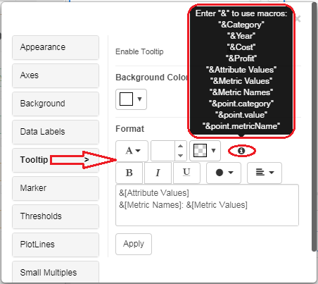
Below is the screenshot of the macro suggestion box. Hover the cursor over the ‘i’ symbol to see the available macros in the chart.
The new tooltip editor component will provide (via invocation configuration parameters) all the possible element names that should be supported as macros. For instance, if a report has Country, Category as attributes and Sales, Profit Margin as metrics, then all the following are possible macros in tooltip editor:
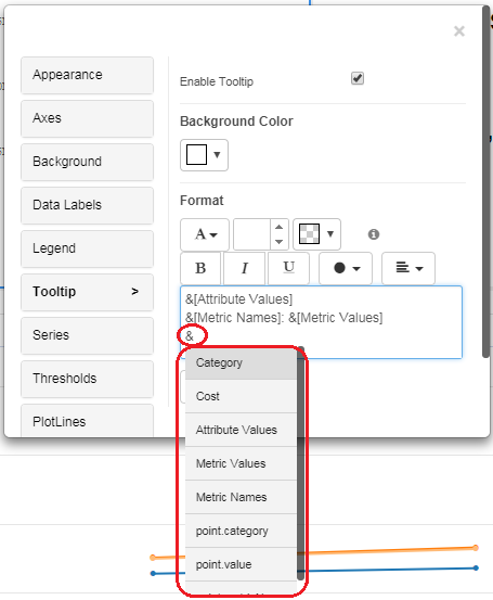
When a user starts typing “&” character, all the possible macro suggestions will be shown.
Once any of the macro elements are selected, the editor displays them in the text (and saves them in the state) as &[macroname]
So for instance, if the user chooses ‘Metric Names’, the displayed macro will be &[Metric Names]
The width of the tooltip is fixed at 30px. The height will grow as needed. There are some special macros; ‘Metric Names’, ‘Metric Values’ and ‘Attribute Values’
Typical usage will be something like:
&[Metric Names]: &[Metric Values]
Or
&[Metric Names] = &[Metric Values]
Here we iterate through all the metrics (including the ones in the tooltip zones and data zones) and present them in the chosen format.
The macro ‘Attribute Values’, as the name suggests, includes the attribute elements (comma separated) at which the data point is evaluated. For instance, if a data point corresponds to Country=USA and Category=Electronics, the ‘Attribute Values’ macro will replace with the USA, Electronics.
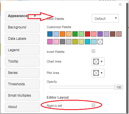
Vitara Charts now supports the right to left scripts. The right to left scripts is generally used in the following languages: Arabic, Hebrew, Persian/Farsi, and Urdu.
Once we enable this property, the RTL mode will be reflected in all Vitara charts. In the ‘global.txt’ file check out for the following line:
#rtlSupport=true
The option is commented out by default. Just delete the ‘#’ character in the above line to enable RTL format for all the Vitara charts.
Below is a screenshot related to enabling ‘Right to Left’ mode in a particular chart.
Open editor window by clicking on the ‘Edit’ button then in the ‘Appearance’ tab enables the ‘Right to left’ checkbox.
The main usage of RTL format is in the grid and micro charts.
The following are the changes made in Grid/Micro charts to fully support RTL format:
Except for Vitara grid and micro charts, in all the other Vitara charts the effect of RTL is limited to only the properties editor window. The options in the properties editor window now have the headers on the right (with the arrow key indicating selection on the left of the text) and the content on the left.
The chart will not show any change.
For each of the properties, the label and the control (i.e checkbox or the select box, etc) will be flipped. The label/header will be on the right and the control displayed on the left.
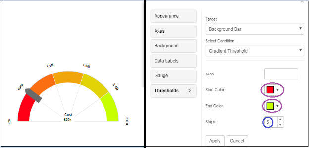
In thresholds properties a new threshold condition called ‘Gradient threshold’ is added to the following charts: Bar, Stacked Bar, Column, Stacked Column, Line, Area, Bubble, Tornado, Sparkline, HeatMap, Column range, Bullet, Calendar Heatmap, Trellis, Mekko, Word Cloud, Dumbbell, Slope, Angular Gauge and Sankey chart.
Gradient thresholds are applied in between two colors with the required number of stops. Based on the Target and Source options, the gradient thresholds are applied on Attributes and Metrics with the Start and End colors.
Click on the Edit Button→ Thresholds Button→ We can set Gradient Thresholds through conditions.
Examples for Gradient Threshold:
1. Here for the Angular Gauge Chart, we can apply the Gradient threshold on Background Bar, and Red as Start color and Yellow as End color, with 5 Stops.
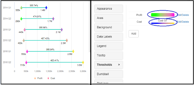
2. Here in the Dumbbell chart, I have applied Target and Source as Cost, and Applied Gradient threshold condition, with alias name and number of stops at 4.
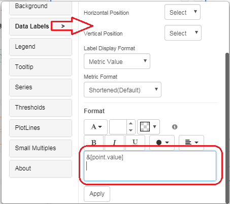
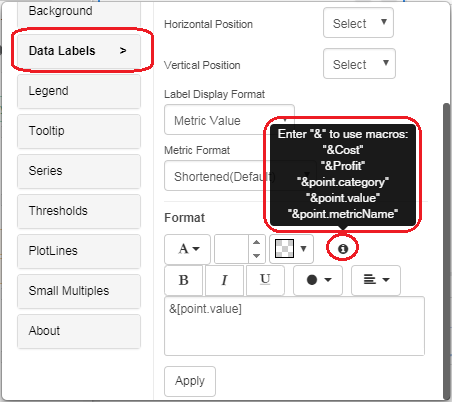
In 4.1 release customization of data, labels has been introduced. We can modify the default data labels using text and dynamic macros for data. Below is the screenshot of the data labels editor window.
Hover the cursor over the ‘i’ symbol to see the available macros for any particular chart. Below is the screenshot.
In the editor window type ‘&’ character and you will see macro suggestions. Select the macros and click on ‘“Apply” tab.
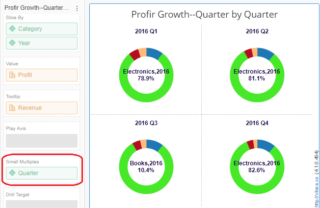
Small Multiples provide data visualization of multiple small, interrelated graphs together in one single display. They share the same axes and scales which allows the user to compare trends across dimensions in a single view. This property is added to the following charts: Bar, Column, Area, Line, Bubble, Bullet, KPI Ring, Stacked Bar, Stacked Column, Slope, Pie, Simple KPI, Waterfall, Tornado, Dumbbell, and Sparkline.
The attribute can be dragged into the Small multiples dropzone and can make any changes in the Small multiples option of the property editor.
Examples of Small Multiples option:
Here for Pie chart, Small Multiples applied on Profit Growth by Quarter-wise.
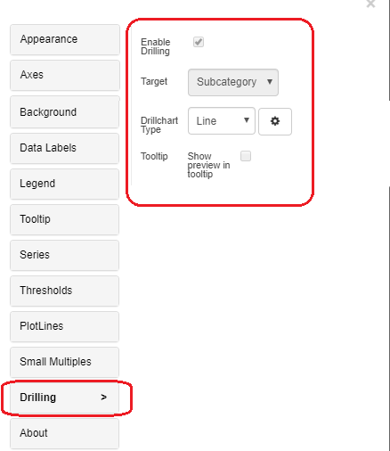
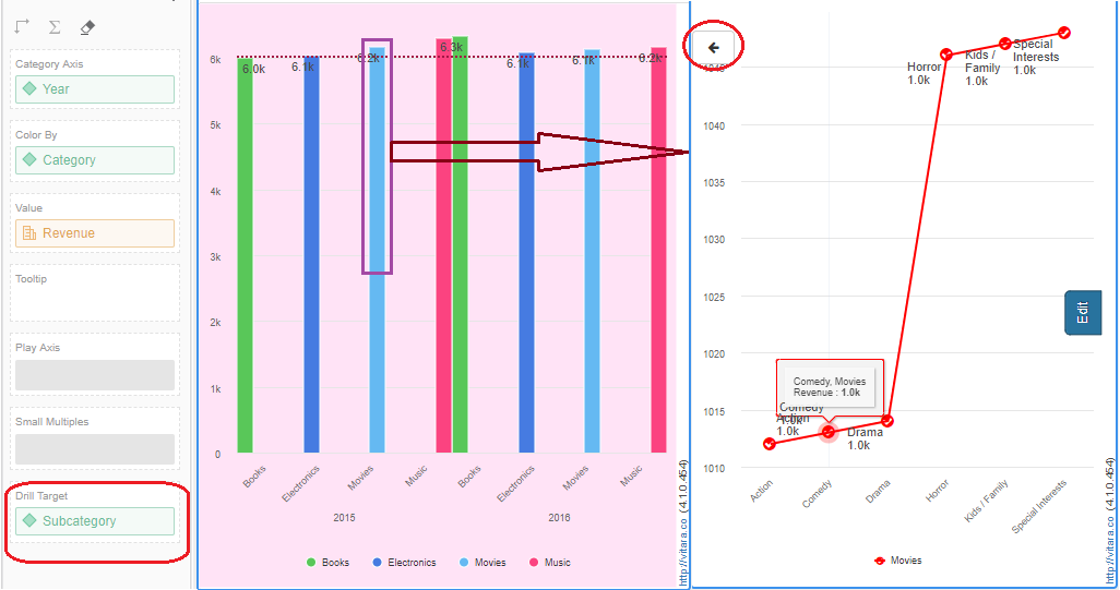
In the chart, you can now drill down to another attribute level. We have a drill target dropzone where we can drag the attribute from the dataset, and check the enable drill checkbox to enable drilling. You can change the target chart type in Drilling options like bar, line, column and pie charts. You have a back button on a drilled chart to return to the initial chart.
Drilling property is now enabled for Bar, Column, Stacked Bar, Stacked Column and Line charts.
Example of Drilling option:
Here, Drilling target is done Subcategory wise, where category movies is selected and you can view subcategories of movies in Line chart shown in the following screenshot.
We welcome your feedback on additional visualizations or questions. To get any information please reach out directly to support.vitaracharts@vitara.co
Proprietary and Confidential